The Making of History: Educational Series (Part 1)
Posted on 3/10/2015
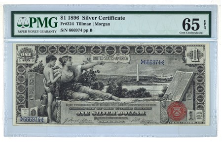
Three notes make up the Educational Series, the $1 (Fr. 224-225), $2 (Fr. 247-248) and the $5 (Fr. 268-270). These three notes are known to be some of the most beautifully made notes in US history. This article on the Educational notes will discuss who made these beautiful notes (while giving some history and context) and will be broken down into two articles. This current article will talk about the $1, while the second article will discuss the $2 and $5.
In 1893, Claude M. Johnson, the Chief of the Bureau of Engraving and Printing (BEP), commissioned three artists (who were paid $800 for each approved design). While $800 doesn’t seem like a lot of money it equates to upwards of $20,000 in 2015 money! The Chief Engraver was Thomas F. Morris. All three of the artists (Will H. Low, E.H. Blashfield and Walter Shirlaw) were muralists by trade – this is one reason why the Educational Series are so beautiful. However, because of how they were designed all lathe work was eliminated when the engraving work was conducted for all notes in the series. Morris did not agree with the lack of lathe work and cited a concern for counterfeiting. These denominations are the only notes in US history to contain no lathe work on the front (there is lathe work on the back of each note). According to Hessler, five of the original paintings hang in the BEP1.
Will H. Low was the designer of the $1 and his painting was entitled “History Instructing Youth”. The Constitution is seen at the right while the Washington Monument and the Capitol are in the distance. Low’s design was approved on May 10, 1894 while the completed design was accepted on July 10, 1894. Morris redesigned the borders and the lettering, but the print run didn’t start until April 18, 1896. The New York Times ran an article discussing a possible error on the note.2 On the note the spelling of the word ‘tranquility’ (which can be found on the left side of the Constitution lines 10 and 11) was wrong. It should have two “l’s” instead of the one. As it turns out, a friend of G.F.C. Smillie (Chief Engraver) already notified him of this so-called mistake. Once this article hit the newsstands the perceived error was already trading for a 10 to 25 cent premium. However, all this was for naught. The spelling is indeed correct as it was acceptable to spell ‘tranquility’ with one “1” during the time of the writing of the Constitution. Charles Schlecht conducted the engraving on the front of the note.
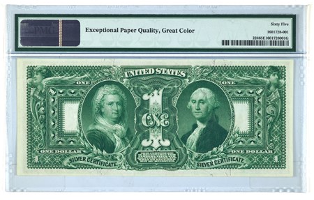
The back features winged liberty with a shield at the top left and right corners, Martha Washington on the left and George Washington on the right. A large “1” sits firmly in the center between the first family. Morris was the lead designer of the back however, Charles Burt engraved the Martha vignette (in 1878), and Alfred Sealey engraved the George vignette (in 1867).3 The remaining parts of the note were engraved by five other engravers: L.F. Ellis, James Kennedy, D.S. Ronaldson, G.U. Rose, Jr., and E.M. Hall.
However, the general public didn’t approve of how the back of the note was set-up. They complained saying “no one should come between George and Martha Washington.” The first family was so revered that it was an insult to place a large “1” as the center piece of the note.
This concludes part one of The Making of History: Educational Series. Get ready for the conclusion in our May newsletter.
1. Hessler, Gene. U.S. Essay, Proof, and Specimen Notes (Port Clinton, Ohio: BNR, 2004), 96. 2. Tranquility With One "L": The New Silver Certificates Follow the Spelling of the Constitution, The New York Times, August 2, 1896, 12. 3. Friedberg, Arthur L., Friedberg, Ira S., and Friedberg, Robert. Paper Money of the United States: A Complete Guide with Valuations: The Standard Reference Work on Paper Money N.p.:n.p., n.d., 75.
Stay Informed
Want news like this delivered to your inbox once a month? Subscribe to the free PMG eNewsletter today!

